Sojern Rebrand


About The Project
Led the rebrand of Sojern in celebration of its 15th anniversary, modernizing the identity, improving accessibility, and evolving the brand system to reflect Sojern's position as a travel tech and SaaS company. The refresh impacted everything from brand guidelines and marketing assets to web design, data visualization, and product storytelling.
Overview
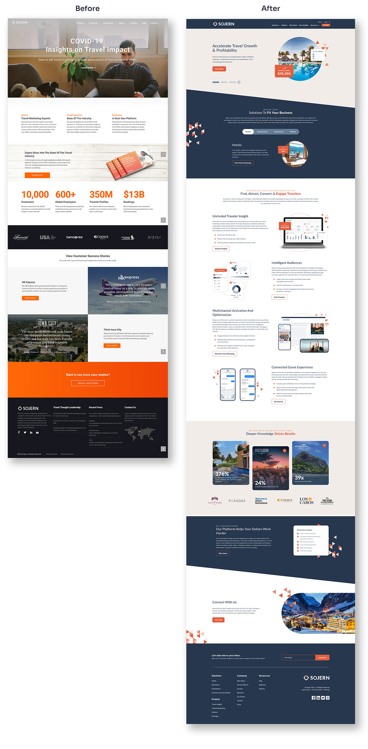
Sojern's brand hadn't evolved since 2017 and no longer reflected the company's position as a modern, SaaS-driven platform. I led a full brand refresh that introduced a new visual identity, updated design system, and completely redesigned website.
Challenge
The existing brand was outdated, relied heavily on the color orange, and was visually inconsistent. There were no reusable templates, no platform visuals, a non-responsive website, and limited accessibility standards, all of which stalled speed and clarity across teams.
Creative Direction
Elevate, not reinvent. Build a scalable brand system that honored the company's history while introducing modern visual language, accessible foundations, and reusable templates to help teams move faster.
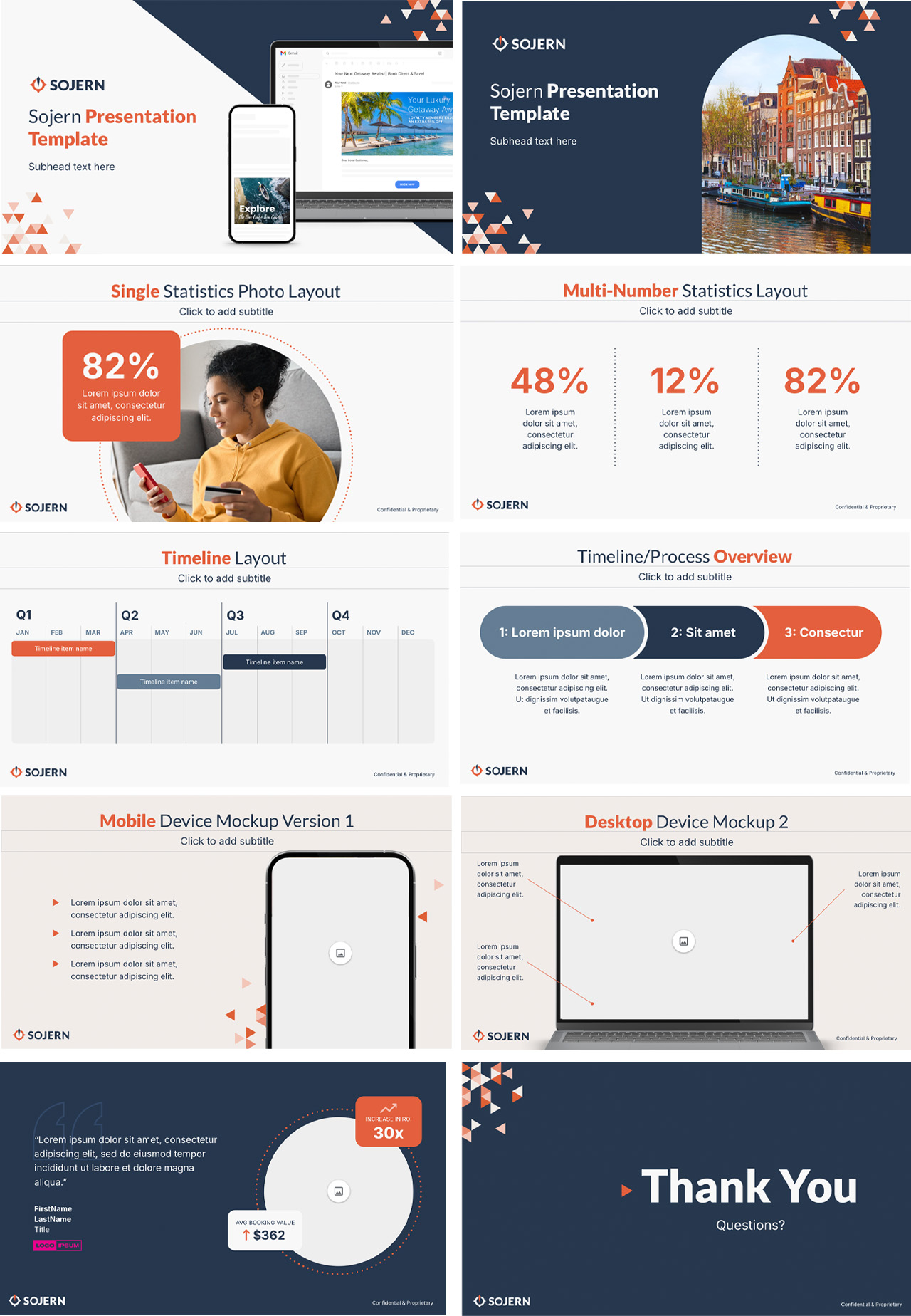
Key Decisions
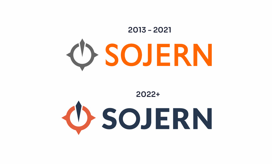
Modernized visual identity with accessibility built in
Strengthened the compass icon, updated typography for digital clarity, refreshed Sojern Orange, and introduced blues, sands, and neutrals for balance and WCAG compliance.
Created motion-driven graphic systems
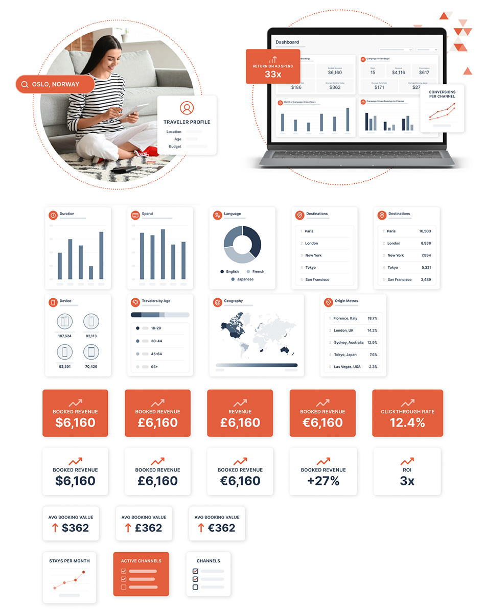
Developed a triangle motif symbolizing direction and momentum, rounded airplane-window containers for photography, and composite graphics combining UI mockups, people imagery, and data to ground abstract value props.
Built reusable systems to reduce team workload
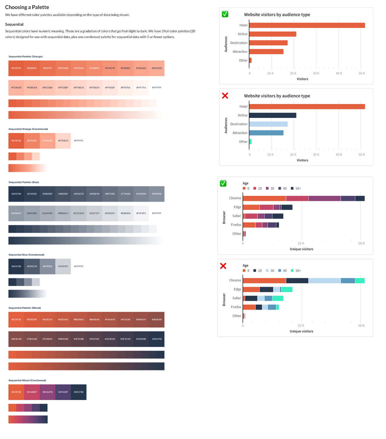
Produced mid-fidelity UI visuals for marketing, developed Tableau themes and charting standards for analysts, and created templates that eliminated repetitive design work across global teams.
Role & Contributions
Led creative strategy and execution across all brand components, built and documented the new design system, drove cross-functional rollout with marketing, product marketing, and c-staff, and trained global teams on the updated brand.
Outcomes
- Complete rebrand delivered in five months for Sojern's 15-year anniversary
- 100% mobile-friendly, accessible new site
- Increased internal speed to launch new materials through reusable templates and visual systems
- Stronger market perception as a SaaS platform


.svg)
