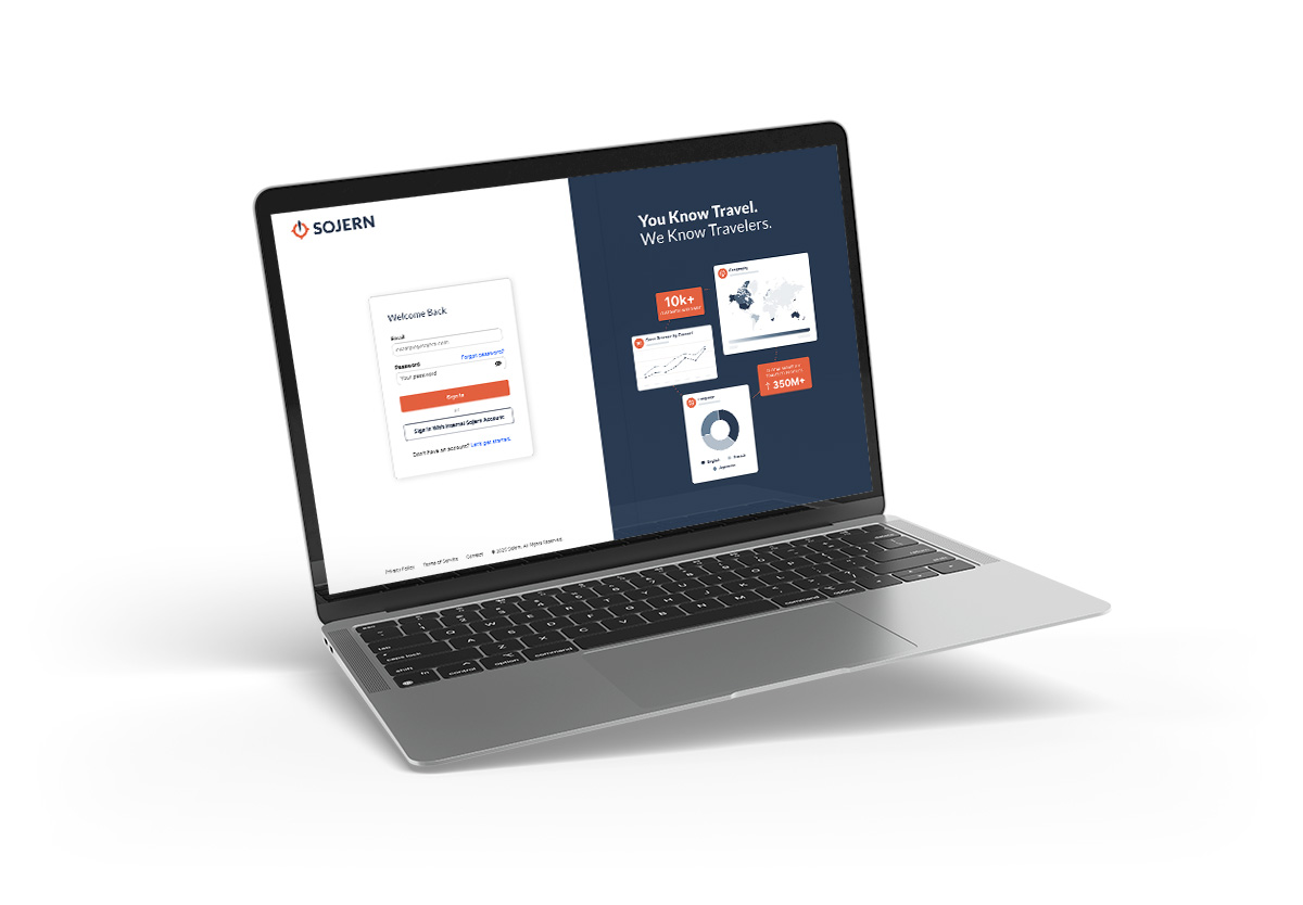
Login Screen Redesign


About The Project
Redesigned Sojern's login screen to strengthen first impressions, improve accessibility, and align with our updated brand system—setting a new standard for product UI across the platform.
Overview
The login screen is the first thing customers see and ours felt outdated. I redesigned it to reflect Sojern's evolution into a modern, user-centered SaaS platform, strengthening first impressions and setting the tone for a more polished product experience.
Challenge
The existing login lacked visual hierarchy, accessibility standards, and brand cohesion. Limited field states and unclear actions made the experience feel disconnected from the rest of the platform.

Strategy
Create a cleaner, more intentional entry point that communicates trust, reduces friction, and aligns with Sojern's updated brand system.
Key Decisions
Structured field states for accessibility
Designed all field states (default, focus, error, empty) to improve clarity and meet WCAG standards. This reduced support friction and made interactions predictable.
Consolidated secondary actions
Removed clutter by streamlining navigation and secondary links, guiding users toward primary tasks without distraction.
Value props at idle moments
Added subtle messaging at login to reinforce platform benefits while users waited, turning downtime into brand reinforcement.

Role & Contributions
Audited the existing UI, led the redesign aligned with our brand system, partnered with engineering to implement accessibility and responsive behavior, and provided iterative feedback during development.
Outcomes
- More polished and cohesive entry experience
- Improved clarity through structured hierarchy and simplified actions
- Stronger brand alignment across product touchpoints


.svg)
