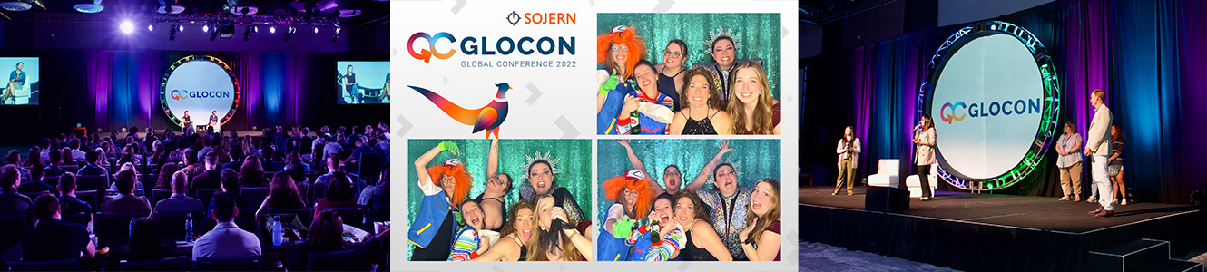
GloCon


About The Project
Rebranded Sojern's annual global employee event, GloCon, into a scalable visual identity system that reduced yearly production costs, saved team time, and brought consistency to the event experience, all while staying playful and on-brand.
Overview
GloCon is Sojern's annual global gathering. Each year previously required a full, built-from-scratch theme—a massive lift for design and marketing. I proposed and built a permanent sub-brand to make the event scalable, cohesive, and instantly recognizable.
Challenge
The lack of a long-term design system led to waste (time, budget, physical materials) and inconsistent identity across years and regions.
Creative Direction
Create a flexible identity that feels celebratory, global, and aligned with Sojern's core visual language while remaining adaptable enough to refresh annually with small, lightweight updates.
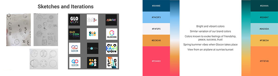
Key Decisions
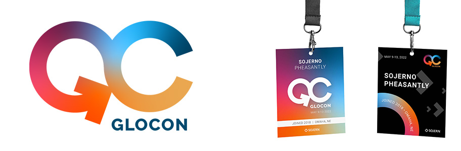
Permanent logo built for continuity
Combined "G" and "C" with an infinity-loop silhouette to represent ongoing connection. The arrow-shaped "G" reinforces forward momentum and aligns with Sojern's brand direction.
Sunrise palette representing global unity
Designed a color system inspired by global time zones and shared connection, creating warmth and energy without relying on Sojern's primary brand palette.
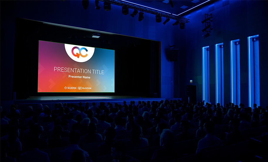
Reusable templates and systems
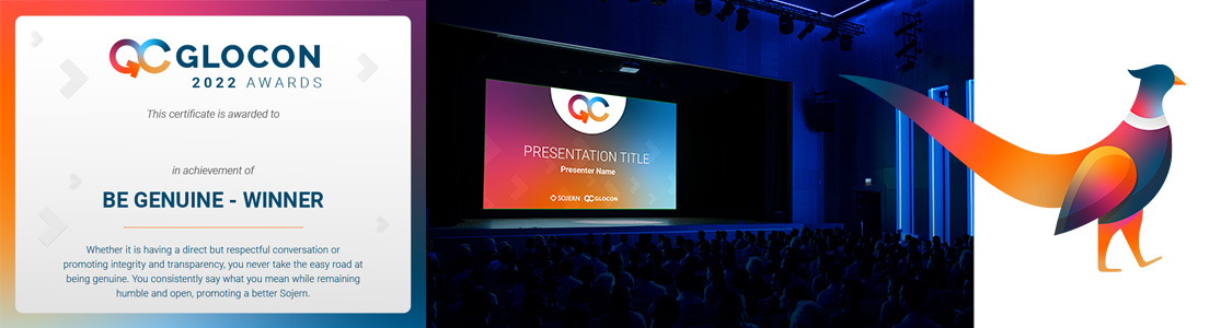
Built event templates covering slides, signage, name badges, and swag to eliminate annual redesign work. Added "Sojerno," a playful pheasant mascot, as an event-exclusive easter egg.
Role & Contributions
Proposed and led the strategic direction for the sub-brand, designed the logo, palette, system, and mascot, and built templates to streamline future years.
Impact
- Saved 50+ design hours annually
- Reduced environmental waste through reusable signage
- Increased consistency and recognition across regions
- Inspired similar sub-branding efforts across internal programs


.svg)
